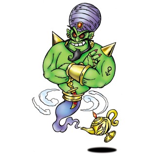
Do you ever just feel designers of Digimon think of a vague concept, look up some stock images or clip art and trace over whatever they find, give it a related name of the keyword they used to search for it, and call it a day?
This was another Digimon that, when I was writing up my list of Digimon for each day, was just an obvious pick
L is For…

This is just not a Digimon. It’s clip art I would have used in a word document for a school project when I was in Primary School two decades ago.
Yeah, I get that it’s adapted from a Digimon design contest entry but they could have made it less like clip art more like Digimon?
I mean, I’m kind of glad a Digimon that’s just Microsoft clip art exists because it reminds me of my first self insert fanfiction which, unlike the second which was found a read on a podcast, was lost on a floppy disc two decades ago – I didn’t have the internet so, instead of using real Digimon and just not having illustrations, I would use clip art and create Digimon based on whatever clip art I chose – Copymon was a photocopier and that’s all I remember. Thanks, digital media for allowing things to be lost to time.
Anyway, I have to go explode into dust after having realised I remember things that I did over 20 years ago.
So, what’s the dumbest Digimon design starting with ‘L’ according to you?