Alright, I had a great time with my last ABCs list, so it’s time for a new one.This time I’ll be looking at each letter of the English alphabet and writing about the worst design for each letter.
Now, obviously these are my own opinions so if you feel like there’s a worse design, leave a comment, I’d be happy to hear. In addition, ‘bad/dumb design’ does not mean ‘ugly’. There are Digimon that are basically fetuses which take the cake there, but I wouldn’t say that they’re bad designs.A bad design is anything I just feel looks dumb or bad.
Also I really like alliteration and it’s almost like the title is in alphabetic order.
Anyway, some of these designs are just here because they’re hilarious.
So let’s go!
A is for…

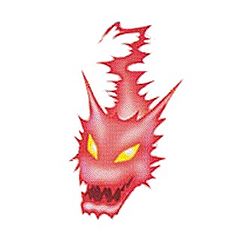
Fuck me I have no idea why Digimon designers decide to give PARTS of existing Digimon sentience and make them their own Digimon. Goddramon has a summon out of his left arm called Amon, and yes, it’s old, but gosh this is outstanding.
Maybe it’s because I have a weird nostalgia emotion to Goddramon when I thought he was Patamon’s natural and only fully evolved form because only Adventure had aired at the time and somebody on the internet said so. I could never quite work out what Goddramon looked like and even now I’m a little perplexed.
His expression LOOKS like it’s meant to be terrifying but it just ends up looking super silly and I kind of love it but I couldn’t not choose the floating angry arm smog.
Just look at his face ok?
So, what’s the dumbest Digimon design starting with ‘A’ according to you?
You can help out the podcast and blog in the following ways:
- Donate via our PayPal
- Our Patreon (if you’d like to make more than just a one-off donation)!
- May’s ko-fi account!
- By spreading the word!
And thank you to our supporters on Patreon; Joe, AnimeGuyKurosaki1, Steven Reeves, Kaida Washi, Chisai, Kyle, DaLadyBugMan, Tom, GlitchGoat, Matthew, Anthony, Lizmet, Sithobi, Nicholas, Sam, Noam, Spiral, Keith, and Alex Ray Snyder (@alexraysnyder)!