Okay, this is a short list, so please forgive me if I roast your favourite or something.
W is For…

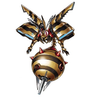
Waspmon looks out of place with his evolution like that starts cute and ends cool and then there’s this guy whose only step was wasp.
Waspmon creeps me out, he’s kinda gross, he looks like a machine wasp, and that’s for a good reason. So his design works in that way, but it’s just such a weird in-between evolution for FunBeemon and Cannonbeemon, not just because of the fact that the colour scheme jumps from yellow to an orange brown and then back to yellow, but because Waspmon is a wasp. What’s worse is the fact that Cannonbeemon then evolves into a scooter. Completely unrelated! (this is a joke, Vespa is a type of wasp, but at least the colour scheme matches).
So yeah, something is weird.
So, what’s the dumbest Digimon design starting with ‘W’ according to you?
You can help out the podcast and blog in the following ways:
- Donate via our PayPal
- Our Patreon (if you’d like to make more than just a one-off donation)!
- May’s ko-fi account!
- By spreading the word!
And thank you to our supporters on Patreon; Joe, AnimeGuyKurosaki1, Steven Reeves, Kaida Washi, Chisai, Kyle, DaLadyBugMan, Tom, GlitchGoat, Matthew, Anthony, Lizmet, Sithobi, Nicholas, Sam, Noam, Spiral, Keith, and Alex Ray Snyder (@alexraysnyder)!